Illustration Friday - Frozen
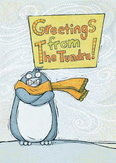

Here's my entry for frozen. This is a new version of an old illustration I did years ago. After walking around most of this afternoon I has first had "Greetings From New England" but changed it "The Tundra" after I warmed up a bit. This was one of my first tries at doing my own lettering. I kind of like how the text came out but I'm not sure I like the placement. The penguin seems colder some how without it.

Comments

pupu said…
Hahhaa his face is funny. ^^*
Ginger*:) said…
He sure is chilly. He does look much colder without the lettering. I would use that lettering style in the future, however, because it looks great on its own.
Linda Kay said…
great image & love that character...lettering is great too
E. Thompson said…
That little guy looks cold. I love how you did his beak and teeth...ahahaha. I like how you used the dots and spirals..nicely done.
Andrew W. Moir said…
I really like your line work and the way you did the background. I would not like to be where he is right now. :)
Shirley said…
I agree with your take on this..he looks much colder being in that vast tundra swirling about him., but I do love the lettering on it's own...maybe it's moving it down to the bottom aligned in cool-tones? Just a thought to keep that cold feel. It definitely is a great style for the artwork. Awesome expression..you nailed it! : )
Unknown said…
Jenn he is adorable!
roberta baird said…
I can hear his teeth chattering!
Mary Hall said…
Great character - love the swirly background too....
marcus cutler said…
I agree, it's much more effective without the text, I think because there's much more windiness and it seems emptier and barren.
this is so cute-really great expression on his face
shawn said…
Brrrrr... he looks sooo cold. Love his chattering teeth.
Meagan said…
That's one of the funniest penguins I've ever seen, and penguins are sort of naturally funny creatures.

Popular Posts